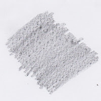
today's task was about collecting textures to use in Photoshop the create more textures so we were given thick soft graphite pencils and paper we only needed to just move the pencil over the texture on the paper and we got the texture the textures came from all over the college from the pavement outside to a locker on the top floor
each texture form this paper scans can be reused to make more accurate textures
once we collected these textures we had to take out a scanner and scan the textures it was awkward to do because the scanner would separate the image to some areas where the textures weren't and mix some textures together
now we had a tutorial on how to create a metal like rock texture
we start by filling a layer with the orange the looks like the tone of copper adding a filter > render> clouds
we start by filling a layer with the orange the looks like the tone of copper adding a filter > render> clouds
we then got this image below
we made alpha channel
we made alpha channel
then the channel was blank so it was black
use the filter > render > clouds again and the channel looks like this
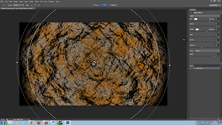
then filter > render > lighting effects
then we have the rock below then we changed the
settings as we wanted to get the rock to look different
then we have the rock below then we changed the
settings as we wanted to get the rock to look different
we were then asked to create 5 textures with the above textures and experiment
these were all made using the lighting effects
these were all made using the lighting effects
this texture was created similar to the tutorial however the image had 4 layers of different colours creating a ribbon like texture on top of the noise I think that this is helpful cause now I know that you can add colour to the texture with layers
this image was created by erasing the channel to get the the track shape to the texture this tells me that I can shape the texture with the channels
this was tire track texture made by a swirled texture and then using the lighting effects and then using the ambiance and spot light this was the result this was helpful cause I found out that you can shape the image using the ambiance and the spot light

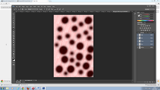
this is a texture before it gone into lighting effects it has giant red spots for blood I was hoping I could create blood texture for future use
I added a twirl just before so it would look like a pool
after I used lighting effects I had resulted in this image
I then had created the text below in a similar way to the cabbage tutorial in a earlier post
I thought that the texture was good however I felt like the word didn't suit the texture enough if i was to create the image again I would experiment in the word that I chose


